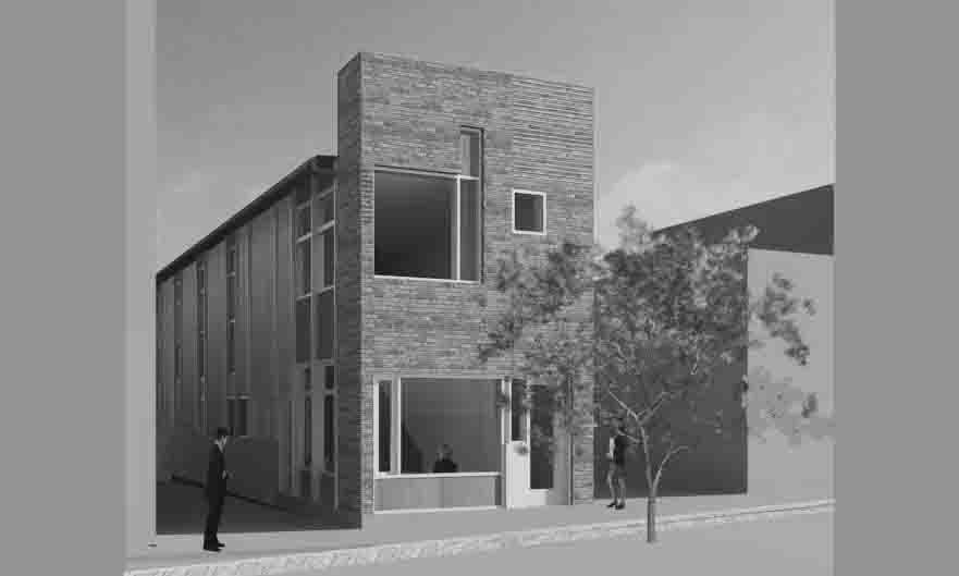
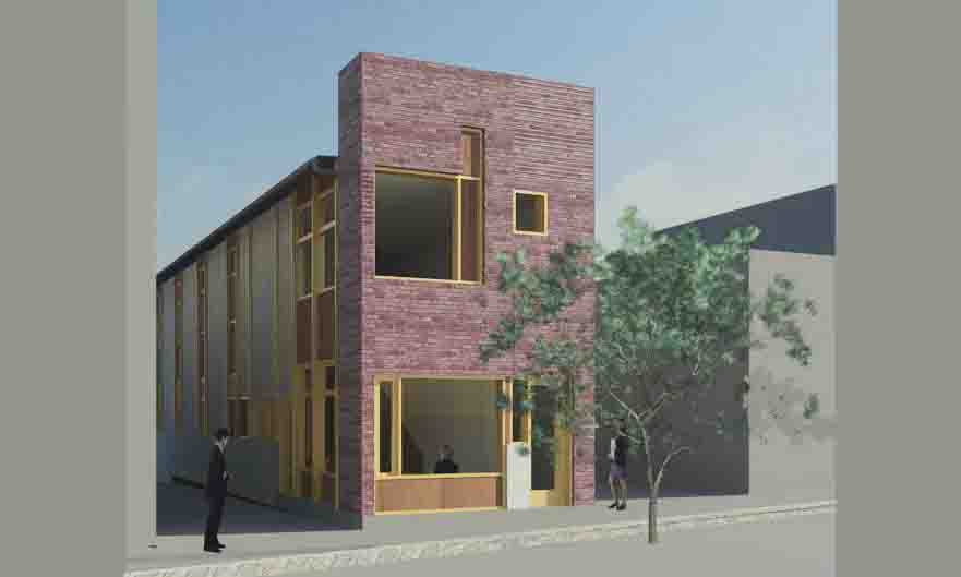
The building is to be built to the north and east boundaries and to the easement on the south side. It is to be set back 5.25 m from the west boundary. The building will have a recycled brick facade to Hargraves Street, a concrete block wall to the north boundary and a ground floor concrete block wall to the east and south elevations with a timber clad wall to the first floor. The roof will be corrugated iron.
The proposed uses are for counselling and therapy rooms for a chiropractic practitioner on the ground floor including waiting room and reception and for four individually let-table offices to the first floor with a separate entry off Hargraves Street.
The plan of the existing building has proportions almost exactly correlating to the classical “golden rectangle” where the the depth is a 1.6180339 multiple of the width. This proportional system has been used to establish the height of the proposed facade in relation to its width, leaving a trace of the old building in the new facade.
Taking on the strategy of a ‘facade zone’ it was realised there will be enough bricks on site to build the new two storey facade. The idea of recycling the existing build fabric was enticing and seen to fit in with both the character and aspirations of Castlemaine.
A number of heritage buildings have been painted over the years often to their detriment, for instance the Talbot Drug Store building adjacent to the site was once a face brick building as was the original building on the site (both shown in the early photograph included earlier in this report).
The recycled brick wall conforms with other buildings in the centre of Castlemaine where the paint has been removed from brickwork that was originally exposed. Along with the recycle bricks the design proposes timber windows and doors and other timber elements including a street seat.
The majority of buildings in central Castlemaine have construction expressed as solid predominating over void. The proposed facade carries this tradition on. The openings in the facade are proportioned (38% void) and positioned using the same system as used to size the facade.
However the window distribution on this facade is an area where the design moves away from the usual symmetrical distribution of the typical Victorian period buildings.
Although asymmetry is not uncommon in Victorian times, see for instance the entry to the School of Mines building in Littleton Street or for that matter the ground floor of the Talbot Drug Store building adjacent to the subject site, it is more familiar in later style buildings.
Because of the diminutive size of the proposed building it was considered that a symmetrical arrangement would lead to a ‘dull’ building where there was an opportunity to bring something ‘more’ to the streetscape.
The streetscapes of the town centre of Castlemaine (excluding the Civic Precinct) are charcaterised by the variety in height and width of the contributing buildings.
This is not a consequences of a lack of planning control over the last century but rather the nature of the original development as can be seen from early photographs.
This character is reinforced by the gaps between building to provide access to the rear of properties.
These lane ways are prevalent through most of the retail streets of Castlemaine with the exception of the west side of Barker Street between Lyttleton and Templeton Streets (refer to the section on Entry below and Attachment A at the end of this report). This block is the only one where a continuos elevation is presented to the street from corner to corner. Even through this block, due to the fall of the ground and the differing floor heights of the buildings, windows and parapets do not align.
The height of the parapet is more often a consequence of the self importance of the building and/or the scale of the footprint than its relationship to its neighbors. In other words a larger two storey building will be taller than a smaller two storey building.
The design proposal has taken this approach and is not as high as either the Talbot Drug Store building to the south or the two storey component of the Heron Gallery building to the north.
The existing building has an entry on the upper (right) side of the front facade at ground floor level with a display window to the left.
This configuration is retained in the proposed design. The difference now is that the door is an entry to the upper level where it makes sense to enter from the higher point (see below for further explanation of the rational around proposed entry positions) rather than to the ground floor (being the only floor in the existing building).
This ground floor configuration is led by commonsense, the first floor can be more symbolic. Most of the first floors of existing two storey buildings in the centre of Castlemaine are disconnected from the ground floors, both figuratively and actually, and often are either empty or entered from the rear and used as dwellings. This residential use, desirable for the life of the town, is in the minority although it does happen in the Talbot Drug store next door.
The first floor use of the proposed buildings however is commercial and should be linked to the ‘street’. The proposed facade design reflects this with a picture window overlooking the street and orientated to the south east towards the ‘action’. This creates a dynamic configuration that also helps wrap the building design around the corner and into the ‘lane’ without loosing the importance of the formal facade presentation to the street. This dynamic facade with its element of abstraction is also a nod to the previous use of the site as an art shop.
A further nod to the existing building is found in the south elevation where the cladding to the first eight meters of the first floor is treated with a dark stain and represents the depth of the original building. The rest of that elevation is stained in a light pigment to reflect light back into the lane.